
lunedì 13 aprile 2015
Una prece per un frocio: Camillo Langone e l'arte del disgusto.
Nei primissimi anni '80 (e per un buon decennio) Reggio Emilia era una capitale della vita notturna. Tra le mille discoteche di ogni sorta e le mille serate che animavano le notti reggiane ve n'era una avantissima, che si svolgeva, se non ricordo male, il martedì sera, in una discoteca storica di via Berta chiamata "Number One" (credo esista ancora). La serata si chiamava "Mexx" ed era, come si diceva al tempi, una serata "trasgressiva". Oggi si direbbe semplicemente "gay". Tra i frequantatori di quella serata c'era un giovane (ma già inguardabile oltre che infrequantabile) Camillo Langone (nella foto), oggi omofobo e misogino rabbioso e bavoso (quello lo era già allora). Il buon Camillo (si fa per dire) era famoso al tempo per provarci con tutti e, in particolare, è ricordato per aver elargito un bacio disgustoso (la definizione è dell'interessato) ad un mio caro amico, che ancora oggi dopo più trent'anni ricorda con ribrezzo quell'esperienza giovanile. Camillo, poi, lo ricordiamo tutti nella sua fase masochista, quando era solito infliggersi autentiche ferite e tagli ed ostentarle in pubblico. Da sempre razzista (in particolare contro i "negri", come diceva), divenne portavoce dell'allora papaverone DC Pierluigi Castagnetti, che non credo fosse al corrente dei deprecabili gusti sessuali del Langone né del suo amore per lame e lamette né tantomeno del suo odio verso donne e "negri". Ora, oggi, Langone si erge come guardiano dell'orotodossia cattolica e dei valori della famiglia ("le donne non dovrebbero leggere e stare a casa a far figli"), scagliandosi furiosamente contro gay e lesbiche... Io lo capisco. Non dev'essere stato facile convivere con quella faccia mostruosa e quel corpo deforme. Era disgustoso già trent'anni fa e col tempo non poteva che peggiorare. Ed era già invaso da quel verme di odio, rancore, livore, invidia e rabbia che, come sul giovane Anakin Skywalker (che però era bello e buono all'inizio), lo hanno trasformato nel mostro d'oggi. Ricordate: dentro ogni omofobo, da sempre (la storia trabocca di esempi) cova sempre una checca repressa. Sempre. Nel caso di Langone è semplice da capire: con quella faccia e quelle membra chi avrebbe mai avuto lo stomaco d'incularselo ( = avere in nota)? Un gay zoofilo, forse, ma è una categoria rara e poi nemmeno come animale (un gibbo? un maiale mostruoso? un lumacone con le zamnpe? un lombricone coi denti?) sarebbe stato "inculabile". Provate voi a svegliarvi ogni mattina con quella faccia. E non poter manifestare i propri sentimenti né amare qualcuno perché tutti ti fuggono al primo sguardo. Povero Camillo! Dobbiamo avere pietà di lui perché la sua è una reazione comprensibile ed anzi umana. Peccato che l'unica cosa d'"inculabile" che oggi ha è il suo male di vivere. Una prece.
martedì 17 dicembre 2013
La gallina ingorda che predica il digiuno
Finalmente anche l'Italia ha il suo Jean Clair. Un giovane giornalista, infatti, ha dato alle stampe un pamphlet nel quale "traduce" in italiano le ultradecennali teorie dell'accademico di Francia. Ma chi è questo nuovo guardiano della tradizione e dell'etica in ambito artistico? Ex-direttore di un settimanale culturale riconducibile a Marcello Dell'Utri, fallito miseramente lasciando a casa la redazione dalla sera alla mattina, ex-presidente di un neonato museo (dalla presidenza del quale è stato cacciato dopo aver provocato un buco di bilancio milionario). ex-consigliere di un geniale ex-ministro dei Beni Culturali (tra i promotori di Mario Resca, ex manager McDonald's poi elevato a Deus ex machina dei Beni Culturali italiani), pupillo del Vecchio Sgarbone, critico improvvisato (grazie alla collaborazione con una di quelle "chiacchierate"gallerie" che hanno letteralmente massacrato il sistema arte italiano con finalità puramente commerciali. Se non di peggio…), ora presidente (ancora per poco, si spera) di un'importante centro culturale nel quale ospita (gratuitamente ed a spese dei contribuenti, mai sue) meeting della fondazione di Maria Stella Gelmini nonché mostre (sempre a spese dei cittadini, mai sue) di coloro che lo hanno sdoganato come critico; fondazione già in deficit, per gestire la quale il nuovo Messia ha dilapidato centinaia di migliaia di euro in spese di rappresentanza (alberghi a 5 stelle, ristoranti pluristellati, voli in business, auto blu e quant'altro. Naturalmente tutto a sbafo, ça va sans dire) e per realizzare mostre fallimentari di amici e amici-degli-amici (eutanasia di un ente pubblico). Senza contare la sua corte di olgettine spacciate per storiche dell'arte, in barba alla povera mogliettina… Come dire: predicare bene e razzolare male. Anzi peggio. Mi ricorda uno di quei predicatori americani che, mascalzoni patentati, campano predicando il Verbo a pagamento. Non a caso il geniale Roberto D'Agostino sul suo altrettanto geniale Dagospia lo ha definito "il presidente di ogni fondazione nella quale presta il suo inutile contributo". Inutile forse per la collettività, non certamente per lui, scroccone, parvenù (basta vedere come s'agghinda), mezza calzetta (non saprebbe distinguere Velazquez da Mondrian nemmeno se ci fosse scritto sotto) e faccendiere (berlusconiano di mestiere, ça va sans dire aussi). Ipocrita parassita: giù le mani da Jean Clair!
venerdì 21 dicembre 2012
I "disegni italiani di Francis Bacon" sono falsi!
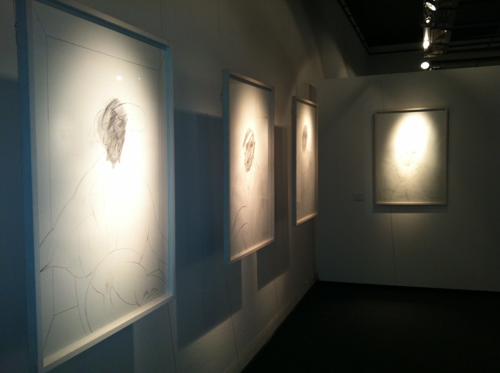
Ecco il dispositivo della sentenza emessa dal Tribunale di Cambridge i 31 maggio 2012 con la quale alcuni "disegni italiani di Francis Bacon", riconducibili al suo sedicente amante Cristiano Lovatelli Ravarino, sono dichiarati FALSI e del conseguente valore di 50 sterline circa (!!!) l'uno.
IN THE CAMBRIDGE COUNTY COURT Claim No. 2CB00067
197 East Road
Cambridge
Cambridgeshire
Thursday, 31st May 2012
Before:
DISTRICT JUDGE PELLY
20. Both the respondent and the bankrupt argue that the applicant has not proved that the Bacon drawings were not genuine. Of course, if they are or were genuine, then the damages in those two actions would probably be nil. However, neither the respondent nor the bankrupt are experts in Bacon’s work.
21. Mr Harrison, in his evidence to me, went rather further than he did in his letters, to which I have previously referred. In his evidence to me, he said this of these drawings: “They are fakes of his work, (Bacon’s work). The style is in every wayconsistent with Ravarino.” Now, Ravarino is an Italian, as far as I am told, of somewhat dubious reputation, who originally supplied all the twelve drawings to the bankrupt.
22. In his statement, Andrew Acquier refers to Martin Harrison as “the eminent Bacon scholar”, and of course, Mr Harrison is the chairman of the Bacon Authentication Committee.
23. In his own statement, Mr Acquier says this on page 211, paragraph 15: “None of the drawings that I examined display the characteristics for which Bacon’s work is so highly prised, namely the portrayal of human nature as twisted flesh. These pencil drawings are placid and non-eventful. They lack any feeling of movement or controlled emotion. They are clearly sketches and not finished works. They use elements such as plain ovals, which are present in authenticated Bacon works, but here they are merely decorative. They are, in my opinion, not of the first order. They appear to be pastiches by someone working within their understanding of the style used by Francis Bacon without capturing any of the elements that prompt collectors of the artist’s work to buy his oils and colour lithographs.
I note from the two letters sent to Richard Thompson and Edward Bigden respectively on 20th October 2007, that Martin Harrison writing on behalf of the Bacon Catalogue Raisonné notes:
‘The draftsmanship is in a style which is inconsistent with all the sketches and paintings currently securely attributed to Bacon.’
***I particularly note the inclusion of all. I am in complete agreement with Mr Harrison’s observation.
In conclusion the two groups of six pencil drawings are, both in my opinion and taking in to account the current expert opinion of the world’s specialist at the Bacon Catalogue Raisonné, not the work of Francis Bacon.
Indeed, I would be most surprised if that world expert opinion were to alter to allow a positive identification at any time in the future.***
As to valuation, I have attached market valuations of the two groups of six drawings and the collection each as a separate document. These represent my true opinion of the value and of the collection. I should add that there are not any recorded sales of similar drawings at auction which I could find.
In my opinion, the actual value of Thompson drawings totals £300. The Bigden drawings, in my opinion, I total value at £180.
sabato 15 settembre 2012
The (fake?) "italian drawings" by Francis Bacon

The attribution of drawings to Francis Bacon (edited by Martin Harrison, June 2011)
This essay looks at the issues surrounding the attribution of drawings to Francis Bacon (1909–1992) and the specific example of the drawings from the collection of Cristiano Ravarino.
This essay looks at the issues surrounding the attribution of drawings to Francis Bacon (1909–1992) and the specific example of the drawings from the collection of Cristiano Ravarino.
Bacon’s drawing
‘We probably know more about Bacon than any other modern artist. The extensive contents of Bacon’s studio, painstakingly catalogued and stored by the Dublin City Gallery, The Hugh Lane, provide an unusually comprehensive ‘control’ sample of Bacon’s artistic output. It does not represent it in its entirety, but contains material from the 1930s to his death. The sample also accords closely to the broader body of securely attributed works (by which I mean those that have sound provenance and are not in any way contested) held in major national collections. These provide a reliable point of comparison for works of art that may or may not be by Bacon in other collections.
As David Sylvester noted, with regard to format, ‘Bacon tended to get set in his ways’. There is evidence that at the very beginning of his career he
made a few simple drawings in traditional media on traditional supports, but by the 1960s he had stopped.
Untitled (Biomorphic Figure) c1933 [ink on lined paper, 167 x 121 mm, Dublin Art Gallery, The Hugh Lane, RM98F1, is an extremely rare survival from the 1930s. Figure in a Landscape, c1952 [oil on paper, 339 x 263 mm, Tate, purchased for Tate Gallery from the poet and friend of Bacon, Stephen Spender in 1998, represents the extreme degree of elaboration for any graphic work of the late 1940s or early 1950s, but is still relatively simple. It is also in some sense a painting as, like much of Bacon’s graphic work, it is executed in oil. The period we are concerned with in this paper, c. 1980s, is much better served for evidence of Bacon’s output and methods.
More material has survived from the 1960s–80s, after Bacon moved to his final studio in Reece Mews in 1961 and Bacon’s extensive interviews with the critic David Sylvester span the same period, 1962–86.
The status of Bacon’s drawing during the 1960s–80s is very clear. If we mean by ‘drawing’ a considered and substantial set of
graphic marks made over a significant time period (more than 10 minutes or so) with professional drawing media on professional
supports, then Bacon did not draw. If we mean works on paper respectfully kept, signed, framed, given, sold or exhibited, then Bacon did not draw. If we mean a small number of marks made in the space of minutes, even seconds, then Bacon did draw, but it is unsurprising that he did not advertise or circulate this kind of graphic practice under that
name, or that he often cleared them away with studio detritus. I shall call them ‘notations,’ to distinguish them from the more traditional forms mentioned above which I shall call ‘drawing’.
Notations were a part of the artist’s process, his ‘workings’. They vary from the guidelines he laid down on a canvas before painting to as little as 2 or 3 strokes on a scrap of paper or printed image, for example a
page torn from L Duissler, Die Zeichnungen des Michelangelo [(Berlin, Gebr. Mann, 1959), Dublin City Gallery The Hugh Lane. Only 41 examples of this kind of graphic work on paper, dating from the 1930s to the 1980s, were found in Bacon’s studio at his death.6 ‘Rough sketches’ on canvas made prior to painting comprised the same kind and number of marks as the notations on paper, but on a larger scale; for example, the unfinished canvas Untitled (Seated Figure), c1979 [oil on canvas, 1920 x 1470mm, Dublin City Gallery The Hugh Lane, and Untitled (figure), c 1979 [pencil on tracing paper, 399 x 294mm folded, Dublin City Gallery The Hugh Lane. If this is drawing then it is drawing that Bacon did not conceal, he just described it in other words.
Sylvester’s particular use of the term ‘secret vice’ in his discussion of Bacon’s preparatory work has been over-determined. It refers to the naturally non-public nature of slight source materials such as notations,
printed matter and text used by Bacon in the studio, and to Sylvester’s gradually evolving understanding of it. References to the secrecy of this practice are not useful; one might as well comment on the fact that
Bacon kept over-painted parts of his paintings secret; the notations were simply a superseded part of a process. Neither Bacon nor those who knew him were ambiguous about the existence of them, and the
studio was not out of bounds . Confusion may have arisen due to critics’ use of the words ‘sketch’ and ‘drawing’ for both the notation that Bacon did do and the more conventional kind of preliminary work that Bacon didn’t do. Sylvester recorded his memory of not realising the implications of the first notations he saw in the 1960s. Although he called them ‘small pencil-sketches for paintings’ they were not conventional preparatory drawings. They were notations; as Sylvester says, ‘in the endpapers of his copy of a paperback edition of poems by T. S. Eliot’, 20mm high and comprising no more than 20 quick strokes (David Sylvester archive, un-catalogued, Tate Gallery Archive).
Sylvester proposed the idea of there being no preliminary drawing because he was very pre-occupied with understanding Bacon’s implementation of what he called ‘accident’ on the canvas and on such a large scale, but this did not stop him from publishing Bacon’s clarification of the matter: In 1962 Sylvester asked:
‘And you never work from sketches or drawings, you never do a rehearsal for a picture?’
Bacon replied:
‘any sketches that I did before could only give a kind of skeleton, possibly of the way the thing might happen’
Sylvester was asking about sketches as drawings, rehearsals; Bacon replied about sketches only as notations. He reiterated the point in a BBC Interview of 1966 and in 1986, the last interview, when Sylvester again suggested that he did entirely without preliminary drawings, Bacon clarified once more:
‘I sketch out very roughly on the canvas with a brush, just a vague outline of something, and then I go to work, generally using very large brushes, and I start painting immediately then gradually it builds up’.
Bacon is entirely consistent in his practice and his statements about it. He does not draw in the sense of traditional preliminary drawings; he does draw in the sense of notations on the canvas or elsewhere, ‘a kind of skeleton’, ‘a vague outline of something’. Sylvester’s conclusion on this is worth quoting at length:
Bacon wasn’t prevaricating… there is a huge difference between his sketches and Miro’s [forexample] in that the latter’s are precise studies and that the canvases are more or less precise enlargements of them, whereas with Bacon the sketches are quick, expressionistic and summary. What counted for him was what happened when he put on the paint. The sketches were no more than tryouts for layouts and, as he said to me in 1979, ‘I don’t think the layout of my pictures is to me really that important. I mean you can use the same layout for the whole of your life. It’s the way they are painted that matters'.
One difference between ‘drawings’ and ‘notations’ (in the sense I am defining them) that has been crucial to critics’ interest in the former and neglect of the latter was their commercial potential. Drawings, even
preparatory drawings, have an established market; As Sylvester noted, Bacon’s notations were ‘never’ made for anything other than private, studio use. They were valued as records and financial assets by
other people late in his career, especially after his death.
Notations made on paper were not generally made on professional supports that were appropriate for display or for preservation, and remained in the studio or were thrown away. The only exceptions pre-date 1961. They are a set of loose sheets torn from sketchbooks (26 from a spiral bound sketchbook of woven paper, 9 from a smaller sketchbook with a perforated edge) left in a book given to Paul Danquah and Peter
Pollock in c.1960 and purchased for the Tate 1998. There are also three further paintings on paper purchased with the earlier Figure in a Landscape, from Stephen Spender. None are signed, but their conventional support and their departure from the studio does place them in a slightly different category.
This may be due to the majority of works being partly or wholly in oil like Figure in a Landscape, scaled down versions of Bacon’s method on canvas, see Falling Figure c1957–61, [pencil and oil on paper, 340
x 270 mm, Tate.
The works in the Ravarino Collection are not in oil and are drawings in the traditional sense, not notations.
They are exhibited in large groups of very similar works. For example, 51 were exhibited at the Werkstatt Galerie, Berlin in 2010. This set is at least 640 x 450mm, many nearly a metre high or over, twice the size
of any extant graphic work on paper by Bacon.15 They are on clean ‘architectpaper’, drawing paper, or drawing board, none of which it was Bacon’s habit to use. An example is Ravarino 2010 no. 16 [pencil on
drawing board, 995 x 700mm, Ravarino Collection. Unlike Bacon’s attributed notations or even his handful of drawings in oil, they are inscribed with Bacon’s name. Bacon’s firmly attributed works include no precedent for a signed drawing, for an extended series of similar drawings, for a drawing that was not a preparatory sketch, or for drawings on a scale over 400mm. Thus it is extremely unlikely that the Ravarino series of large drawings are from Bacon’s studio or his hand. With an artist of Bacon’s importance, however, it is prudent to look into the style of the works, as well.
Comparison with attributed works
In excess of six hundred drawings from the Ravarino collection are said to exist or have been brought forward, far in excess of the less than one hundred graphic works on paper that have firm authentication.
Those circulated since 1997 are more consistent in style, composition and medium than the Bacon notations. I shall use examples from the Werkstatt Galerie in 2010. As they are untitled and undated, they are identified by the date of their exhibition and catalogue number. In order to evaluate them it is necessary to identify works incontestably attributed to Bacon that are the closest in date and type. In the case of an artist about whom so much is known, this would be easy if the Ravarino works were part of his oeuvre; it is not.
The lack of anything approaching a conventional drawing in Bacon’s output from 1960 onwards and the profound differences between his notations and the works in the Ravarino collection make it difficult to
find comparators. The six notations in Tate that are executed in pencil on drawing paper (from two different sketchbooks) are the closest – see Man on a Bed c.1957–61 [Tate, pencil on paper, 254 x 190 mm. and Seated Woman c1957-61 [Tate, pencil on paper, 254 x 190 mm].
Although they do not coincide in date, are not signed and not a series or set, in some respects they are useful in providing comparisons to the Ravarino works. The only notations in relatively conventional mediums and supports from the early 1980s are a small number of ink or pencil notations on tracing paper or paper scarps found in Bacon’s studio at his death, such as Untitled (Figure), c. 1979. One notation is, unusually, on a pad of paper, Untitled (Torso and legs), 1980s [pencil on paper, 298 x 21 mm, Dublin City Gallery, The Hugh Lane, ARM98F103:8]; yet it is not a sketchbook; it is a ring-binder refill pad purchased from a newsagent and no other sheets are used. Since no notations coincide with the
compositions of the Ravarino drawings, some comparisons can only be made by looking at Bacon’s paintings. I have chosen a late image of a Pope and a self-portrait of the date that Ravarino says his
drawings were made (c. 1980s), as the closest in period, subject matter and arrangement.
A comparison of ‘hands’
In the nineteenth century the art historian Giovanni Morelli placed attribution through the study of ‘style’ and particularly individual ‘hand’ on a systematic, diagnostic basis, known as the Morellian method. It
raised insignificant details unlikely to be noticed by students or imitators (such as ears, or automatically rendered components such as architectural frameworks), above the significant or obvious aspects of medium, composition, style and subject matter.
1. Framework:
Typically, Bacon’s places an organic form within geometric space made up of lines. These make a good starting point. The lines on drawings in the Ravarino collection act as a backdrop for the figure, see Ravarino 2010 no. 4 [pencil on drawing board, 995 x 700mm, Ravarino Collection. Even
orthogonal lines at the bottom of the drawings, which conventionally suggest three dimensional space, read as background pattern, see Ravarino 2010 no. 39, [pencil on board, 995 x 700mm, Ravarino
Collection. Bacon used lines according to a different underlying principle. His lines contain the figure, locating it powerfully in space; and raise the figure up, he wrote ‘the alteration of level is, from my point of view, very important. If we compare any of Ravarino’s centrally positioned man/popes with a picture of the same format, Study from Portrait of Pope Innocent X, 1965, oil on canvas, 1980 x 1475, private collection, we can see Bacon’s lines run behind and in front of the figure. The same is true
of Bacon’s notations on paper: The setting of Untitled (figure mounting a step), 1980s [pencil on tracing paper, 420 x 295mm, the Dublin City Gallery, The Hugh Lane, RM98F15:48, looks at first glance similar to the setting of Ravarino 2010 no. 4, while its lines enclose and raise the figure and those on Ravarino 2010 no. 4 do not.
2. Framework of the eyes:
There are no precedents for Bacon notating a full face and features on paper. Even if we were to accept that the Ravarino drawings are a one-off, again the features themselves are made according to a different
underlying principle than Bacon’s. Bacon looked at the marks that make up the eye in a Rembrandt.
There are hardly any sockets to the eyes, that it is almost completely anti-illustrational... there is a coagulation of non-representational marks which have led to making this very great image.
We can see that this is true of Bacon’s eyes as well. Most of his heads are more distorted than the heads in the Ravarino drawings; Three Studies for a Self- Portrait, 1979–80 [oil on canvas, 375 x 318mm, MoMA,
New York is one of the least distorted, so gives us the closest possible comparison. Even so, it is very different. What we experience as seeing an eye and lid in a socket in the Bacon is, in fact, like the Rembrandt, a collection of swatches of paint; none of them literally and entirely describe the structure of an eye. The eyes of drawings in the Ravarino collection, such as Ravarino 2010 no. 39 and no. 4, collection are composed of a circular pupil, sometimes with a small black circle within, capped by a line that equates to the lid which sometimes even continues round to define the lower lid as well; Bacon would call this ‘illustrational’. Sometimes the eye is rubbed or drawn over, but in all cases there is a discrete diagram of the eye.
The socket in Three Studies for a Self- Portrait is created by the same swathes of paint as the eye.
Ravarino 2010 no. 4 and others suggest the socket separately by a closed oval and circle that is also reminiscent of spectacles. If Bacon chose to emphasise the oval of the socket he did not do it illustrationally like this, by means of a complete oval shape, but by a combination of marks that simultaneously suggested adjacent forms of the face as well, locking them all together. A very simple example is the large, dark ٨ above the right eye of the central figure in Bacon’s Three Studies for a Self-
Portrait. This single mark contributes to the sense of the lid as curving into the nose, the projection of the brow, and to the recession of the temple and the sharpness of the cheekbone on the opposite side of the eye. Bacon does occasionally use self-contained ovals, as in Triptych 1976 [oil and pastel on canvas, 1980 x 1475, private collection], but they are not part of the face at all.
3. Marks
The virtuosity of the range of marks collected in a Bacon is one of the reasons his paintings are valued so highly and compared with Rembrandt and Velasquez. Three Studies for a Self- Portrait is a wonderful example, but in order to provide a comparison restricted by the limitations of the pencil medium, we need to look at the drawings in the Ravarino collection and Bacon’s rare pencil drawings in the Tate. A general
glance at Man on a Bed c1957–61 and Seated Woman c1957–61 tells us that the Ravarino drawings lack the agility of line of the Bacon’s pencil notations. There is no hint of the vivacity and graphic skill of the Japanese art or old masters Bacon admired, of his own idiosyncratic and inventive
mark making.
Bacon’s Man on a Bed, c.1957–61 shows us:
a) Bacon varied the pressure exerted on the pencil – In Man on a Bed the lines are heavy and light. The drawings in the Ravarino collection are made up almost entirely of marks of the same width and intensity. The only variation occurs when the has been smudged afterwards or an eraser has been used to reduce them. There is no distinction between the kind of marks used for straight lines or free, curved lines. The fact that many of the straight lines have been made with a ruler, by drawing the pencil along at an even rate and pressure, is further evidence that curved lines of the same width and intensity were also drawn with a neutral, uniform press on the paper.
b) Bacon never simply ended a line, they end in suggestive ways by turning or lifting or pressing the pencil. Man on a Bed we see a disappearing trail (middle right hand horizontal), flicks, an emphatic
cut (horizontal into the figure’s groin). The lines of the Ravarino drawings do not have expressive or varied ends. The lines stop when they reach the figure and then continue on the other side, as though they have been put in afterwards. Bacon’s often run through the figure.
c) Bacon’s lines change direction in different ways - a sharp angle or a gentle swerve. A very specific comparison can be made between the handling of undulation in the Ravarino drawings and Man on a Bed. The Ravarino drawings use wavy lines a lot but without much variation. The designation of the centre of the Pope’s cape in Ravarino 2010 no. 2 and no. 3 [pencil on drawing board, 995 x 700mm and 640 x 445mm, Ravarino Collection and no. 4, simply snakes back and forth.
If the viewer imitates making the line with their hand they can feel the relaxed nature of the wrist. The same applies to loping or looping lines such as the edge of the cape. Bacon’s undulations, by contrast, vary according to the form that is being suggested. For example, in Man on a Bed a fuller curve for the bulging thigh muscle changes to a smaller one for the knee further on. If the viewer imitates making the line of this leg, the wrist is necessarily tense and controlled. Bacon’s undulations provide rhythm and movement and energise the line in a way that the relaxed Ravarino drawings do not. Compare the cape of Ravarino 2010 no. 2 and no. 4 with the cape of Study from Portrait of Pope
Innocent X.
d) Bacon integrates interior and exterior . The Ravarino lines are either contour, enclosing a shape (such as the hats, heads, penis and testicles, capes, lapels, even hands), or they are filling inside a contour, usually hatching (such as the filled-in pupil and filled-in beard of Ravarino 2010 no. 4 or the filled in face of no. 16 and no. 39. The contours of Bacon’s Seated Woman and Man on a Bed are typical in that they weave contour and texture, outside with inside, together, a technique also seen in Rodin, Rembrandt and Michelangelo. Bacon commended this in his statement on Matthew Smith: ‘a complete interlocking of image and paint, so that the image is the paint and vice versa.
Here the brushstroke creates the form and does not merely fill it in.
This is very clear; Bacon does not favour separate outlines like those found in the Ravarino drawings
e) Bacon does not repeat the same mark. The back and forth hatching in many of the drawings in the Ravarino collection, although sometimes altered afterwards by rubbing or erasing, is automatic and
regular. Bacon’s hatching varies constantly to create nuances of the form and texture. The lines that fill in the head and décolletage of Seated Woman are not like the lines that fill in the head of Ravarino 2010 no.
4 (or no. 16, no. 39 or many others). Bacon’s lines cross between the inside and outside the form and they are irregular so that they suggest the jowl, the eye, the throat diving into the cleavage, and so on.
4. Repetition
The mark of an exceptional artist is the mark itself, no mark is ever repeated; each is a new thought on a problem. This is an observation made by Seymour Slive on the graphic work of Rembrandt, but it
certainly applies, in general, to Francis Bacon.
The repeated shapes that are so common in the Ravarino drawings violate the principles of asymmetry, invention and research that are fundamental to Bacon’s notation. The identical left ear on Ravarino 2010 no. 2 and no. 3, is a good example, as are the repeated circles that are used to notate buttons in other drawings; again compare these with the complex cape of Study from Portrait of Pope Innocent X.
The re-use of the rounded back and forth line for both lapels in Ravarino 2010 nos. 2, 4 and 39, or the even simpler cape curves either side, are typical of many repetitions and simplifications of this kind. The
Ravarino drawings reduce and summarise the lapel, rather than investigated it, and the way it relates to other parts of the form as Bacon does. He understands, from Michelangelo and Rodin for example, the
way that asymmetry enlivens a form, especially a centralised form, such as the portrait format. The white shirt collars in Bacon’s Three Studies for a Self- Portrait’s appear at first glance symmetrical like those in the Ravarino drawings, but they are not; they are different combinations of marks: On the left, a dark stroke under a thin light stroke on the left ends sharply; on the right, two more blended light strokes divided by a central dark streak in the middle end in a fade.
Compare also the repetitive notation of the fingers of the hand in Ravarino 2010 no. 2.
Noone who has contemplated and enjoyed hands, looked at Rembrandt’s heartbreakingly clumsy hands or thought as carefully about Michelangelo as Bacon did, could make these. In fact Bacon’s hands are often condensed into clubs; digits are more clearly distinguished in feet. They are never a regular row of loops.
There are no drawings of hands to compare, but a similar fan of rounded forms representing a reclining figure can demonstrate the difference between shapes that are differentiated, like Bacon’s and automatically repeated, like the Ravarino drawings, Untitled (based on Michelangelo, Night, The New Sacristy), no date, [pencil on chain-laid manufactured paper, 298 x 21 mm, Dublin City Gallery, The Hugh Lane, RM98F125:8].
42 works on paper, most of them in oil, have been identified as Bacon’s graphic work in national collections. A further 41 graphic notations were found in the studio. These were far exceeded by printed material that served a similar function of suggesting motifs and forms for paintings. 83 graphic works is a tiny number from a fifty year career from which 600 paintings on canvas survive. Bacon left over a 100 abandoned canvases in the Reece Mews studio alone. Notation was an important but tiny proportion of Bacon’s practice. A series of 51 pencil drawings such as those in the Ravarino collection (and even more so the alleged total of over 600 drawings) is dramatically inconsistent with this pattern.
Artists make drawings for different reasons: as a preparatory stage towards a more final work of art, or as a final work of art in itself, or both. Bacon made preparatory notations throughout his career, especially in
the transitional period 1959–62. A few made before 1962 could be considered simple drawings and a few left the studio, but after this date all attributed work took the form of preparatory notations. There is
no precedent for Bacon making finished drawings as self-sufficient works of art, like those in the Ravarino collection.
The medium of the Ravarino drawings is not consistent with Bacon’s graphic practice. The studio contents revealed that almost all ‘preliminary studies’ were printed images, many modified by damage, folds or marks. Some printed matter or other forms of paper bear lines or notations. The small number of these lines, there can be only as little as one or two, and their quick gestural nature, suggest that they occupied the artist for a matter of seconds rather than minutes. There is no evidence of consistent use of any particular drawing medium or support with the exception of tracing paper (of which there are 12).
Supports tend to be materials that were ‘to hand’, an envelope, fly-leaf, piece of card, or letter paper.
There was no surface in the Reece Mews studio on which to accommodate sheets of the size used for the drawings in the Ravarino collection other than the artist’s knee. There are no pin marks on the corners of
the drawings. There is no evidence of Bacon’s regular use of pencil. Bacon’s mediums tended to be ‘wet’– ink, felt-tip or paint; pencil is slippery on tracing paper.
Bacon drew a great deal, in the sense that he explored graphic marks all the time, but he was one of many artists of his era who dispensed with paper and mostly drew directly on the canvas in oil. He found it less useful to explore marks in a different medium or on a different surface. The 100 abandoned canvases might also be considered as preparatory work. This was because the marks were very dependent on the medium in which they were made and because he was specialising to an unusual degree in the kind of marks that can be made with paint, evolving a very sophisticated understanding and virtuosity. Markmaking in other media was not effective ‘preparation:’‘not very helpful in my kind of painting as the actual , texture, colour, the whole way the paint moves, are so accidental, any sketches that I did before could only give a kind of skeleton,
possibly of the way the thing might happen’.
The fundamental principle of Bacon’s graphic work was transformation. Notations changed their source image, and were in turn changed themselves. Tracing paper is particularly appropriate for this. The 12
efficient works on this surface couldn’t be more different from the laboured Ravarino drawings in this respect. For example, Untitled (based on Michelangelo, Night, the New Sacristy) registered Michelangelo’s sculpture in the new form of five, fanned loops. The subsequent crumpling of the paper was another kind of notation that condensed and altered the image again and suggests sculptural drapery forms. Untitled (kneeling figure) [pencil on tracing paper, 416 x 295 mm, Dublin City Gallery The Hugh Lane, RM98F107:25B] comprises a mere 8 pencil lines on tracing paper which summarise a headless kneeling torso and legs with a shadow. RM98F107:25A [pencil on tracing paper, 416 x 295 mm, Dublin
City Gallery, The Hugh Lane] reduced the same form to 4 lines 2 continuous, two brusque. Another fifth pencil line alters the shadow to echo the knee. RM98F107:25C [pencil on tracing paper, 416 x 295 mm,
Dublin City Gallery The Hugh Lane] adds setting, placing the figure against framing lines and reconfiguring the thighs on a more downward slant. This paper is not crumpled but folded, perhaps to make it less transparent and heighten contrast. The line provided by the edge folded into the middle contributes another tramline. This and other preparatory work was further transformed by accidents of reproduction, age and defacement. ‘By establishing, isolating and transforming the image, Bacon could then use the sketch as a point of departure for work on a larger scale. He is extremely unlikely to have repeated old (indeed obsolete, in his oeuvre) motifs to the extent that they are repeated and elaborated in the Ravarino collection.
Conclusion
Bacon evolved a ‘unique technical vocabulary’33 in all mediums. He was dismissive towards those who had a simplistic and under-informed concept of the artist and about what they did, including drawing. He was acutely aware that modern art had moved on, that the interdependence of mark and medium was being explored in a vastly expanded array of tools, vehicles and surfaces of which charcoal, pencil and ink on paper were an important, but small subset. He distanced himself from the latter. His famous quip to Michael Ayrton, ‘Is drawing what you do? I wouldn’t want to do that’, makes most sense if taken most literally: he wasn’t interested in drawing in the limited sense that Ayrton ‘did’. Bacon’s statement about
Giacometti’s drawing being his best work, sometimes taken to imply belittlement of the sculptor’s modelling, or sculpture in general,35 is a perfectly transparent statement, reiterating Sylvester’s appraisal of Giacometti’s drawing as ‘perhaps the most perfect aspect of his art’.
Bacon discarded the traditional polarisations between drawing and painting, line and hue, even painting and sculpture, and expanded the role of the graphic mark in all sorts of ways. Bacon ‘drew’ on canvas
with paint. In this medium he developed breathtaking skill and it provided tests, problems, accidents and revelations that he had by no means exhausted even at his death. There was no reason for him to take up a
pencil and draw its dry, confined, monotone lead across an expanse of a clean, uneventful, uniform, white surface – that is not what Bacon ‘did’.
lunedì 16 luglio 2012
Lo scandalo di Palazzo Te

Caro direttore,
leggo della mostra "4 Ways" di recente apertura a Palazzo Te e desideravo sottoporLe alcune riflessioni. Premetto di aver sempre ritenuto le collaborazioni pubblico-privato una via felice nella promozione culturale e nella vivificazione/valorizzazione di spazi espositivi pubblici altrimenti inutilizzati, ancor più in un momento economicamente difficile come quello che stiamo vivendo. Ciò, però, dovrebbe avvenire almeno senza gravare di un centesimo sul bilancio dell'ente, soprattutto se economicamente dissestato come il Centro, e non, come nel caso di questa mostra, addirittura rappresentando un costo. La mia esperienza in merito m'insegna che qualunque realtà privata è interessata ad organizzare eventi pubblici anche solo in cambio della sola disponibilità degli spazi, soprattutto se prestigiosi come quelli in oggetto, accollandosi OGNI costo. Lo scorso anno, ad esempio immediato e ravvicinato, la grande mostra del pittore Massimo Giannoni presso il Palazzo della Ragione, in occasione del Festival Letteratura, è stata organizzata e pagata interamente da una galleria privata di Roma, non gravando in alcun modo sul bilancio comunale. Quello che sta avvenendo a Palazzo Te, oltretutto in favore di una galleria privata (Italian Factory e la sua controllata First Gallery di Roma) con la quale il presidente ha intrattenuto ed evidentemente intrattiene rapporti di lavoro personali, delinea un inaccettabile e arrogante conflitto d'interessi che non può e non deve lasciare indifferenti. Lasciando un attimo in disparte i rapporti economici del presidente (che sarà stato ovviamente remunerato da suddetta galleria per le proprie passate prestazioni di "curatore"), come si può accettare che un ente pubblico, pagato con denari pubblici ed oltretutto gravato di un poco invidiabile passivo di bilancio, si accolli ulteriori spese "a fondo perduto" per la realizzazione di una mostra a beneficio suprattutto della galleria privata che gestisce il mercato degli artisti coinvolti? E guarda caso questa "beneficenza" è indirizzata proprio a favore dell'unica galleria privata italiana che ha permesso in passato al presidente di fregiarsi di un improvviso quanto improvvisato titolo di "curatore": il sospetto di un do ut des, come vede, appare tutt'altro che infondato. Io credo che sarebbe stato meglio e decisamente più consono utilizzare i propri eventuali contatti e le proprie conoscenze per convogliare su Palazzo Te realtà private in grado di fornire progetti realmente a costo zero, se non portatori di fondi per il Centro, ad esempio affittando gli spazi a prezzi competitivi, così come avviene altrove. Continuo a non vedere nel comportamento e nelle scelte del presidente Crespi alcuna azione atta al bene ed agli interessi del Centro Internazionale di Palazzo Te. Viceversa continuo ad osservare azioni in continuità con un ben noto e triste passato, vedasi l'esempio del MaGa di Gallarate, lasciato da Crespi con una voragine di disavanzo dopo poco più di due anni di "gestione", caratterizzato da scelte arbitrarie ed arroganti sempre in odore di personalismi oggi fuori tempo massimo.
Il presidente, poi e manifestando una coda di paglia difficilmente eludibile, ha messo le mani avanti dichiarando che qualche "critico" avrebbe definito questa mostra una "marchetta": excusatio non petita, accusatio manifesta?
giovedì 7 giugno 2012
Aemilia | ARTquake. L'Arte della solidarietà

www.facebook.com/groups/lartedellasolidarieta/
Il terremoto è un evento che, prima ancora che la terra, fa tremare l'anima. Non occorre esserne vittime dirette, che ti crolli il mondo attorno e che ti ritrovi, in pochi secondi, a ricominciare da zero. E' un evento che genera panico, quello silenzioso e profondo che ti si radica dentro, minando alla base il castello di sabbia di certezze acquisite e fino ad allora indiscusse. E poi l'impotenza, l'impossibilità di fare qualcosa contro l'ineluttabile. Terrore panico che non ti lascia tregua. E pena, quella nobile, verso tante persone che in una frazione di vita, dopo tanto lavoro e tante speranze, si trovano senza più nulla. E' un dovere etico, prima ancora che un obbligo frutto della necessità, operarsi per aiutare chi in questo momento vive la drammaticità degli eventi e l'angoscia per un futuro incerto. In questa ottica credo sia doveroso anche da parte di chi vive "la parte più bella del mondo", l'arte, adoperarsi per aiutare chi ha bisogno ora più che mai. L'idea è quella, supportata primariamente dall'Accademia di Belle Arti di Bologna e dal Comune di Reggio Emilia (e di tutti quelli che vorranno aiuarci in futuro) di organizzare una raccolta di opere d'arte la cui vendita sia finalizzata alla precisa ricostruzione di un'edificio di pubblico utilizzo nelle zone terremotate. Nei prossimi giorni cercheremo di individuare un obiettivo preciso, senza percorrere le insidiose e generiche vie di una solidarietà qualunque. A questo progetto, che non ha altro protagonista se non l'aiuto alle popolazioni colpite, sono chiamati a partecipare artisti d'ogni parte d'Italia, curatori, critici e galleristi dalle formazioni più disparate, semplici cittadini. Ad ognuno di loro verrà semplicemente chiesto di donare un'opera che successivamente, sotto l'egida ed il severo controllo di un ente onlus (che stiamo cercando di individuare), entrerà a far parte di una mostra pubblica a Reggio Emilia prima di essere posta all'asta per devolverne il ricavato a favore delle popolazioni colpite. L'idea, maturata nelle ultime ore, è, come vedete, ancora in fase di definizione, ma pare urgente iniziare sin da subito nel diffondere l'iniziativa e raccogliere ideali adesioni. Maggiori ragguagli saranno forniti nei prossimi giorni mano a mano che il progetto prenderà forma e contenuti. Abbiamo già raccolto l'adesione del Comune di Reggio Emilia e dei suoi Civici Musei e nelle prossime ore si avvieranno i primi incontri per iniziare a concretizzare quella che ora è solo una semplice idea.
Chi intende partecipare può inviare la propria adesione a: lartedellasolidarieta@gmail.com
giovedì 17 novembre 2011
La Natura Rediviva. Del somaro.

“Nature Redivive rappresenta la più rilevante esposizione pittorica di Natura Morta contemporanea mai realizzata in Italia, per numero e qualità degli artisti partecipanti e assume un rilievo internazionale grazie alla partecipazione di prestigiosi artisti esteri, fra cui il francese Philippe Garel e la spagnola Isabella Molard”.
Già solo questo basta a far scompisciare dalle risate. Non tanto o solo per la grossolanità dell'affermazione (“il sonno della ragione genera mostre” verrebbe da dire osservando il desolante panorama espositivo italiano, pieno solo di nomi ma senza idee né contenuti al loro interno), ma per i contenuti, frutto di scelte non solo parziali ma troppo limitate per poter sostenere un'affermazione del genere.
Prima di tutto si tratta di una mostra quasi completamente plagiata da precedenti esposizioni ideate e curate dal sottoscritto. Anche e non solo perché in essa sono contenuti una quantità di artisti notoriamente scoperti e sostenuti lungamente dallo scrivente, ma complessivamente per le scelte, che in larga parte, troppa, ricalcano quelle contenute nella mia mostra “Nature in posa” del 2004 e “Contemplazioni” del 2009, penalizzate da omissioni gravissime, specie dopo un'enunciazione come quella affermata e, soprattutto, per essere una mostra apparentemente pubblica, quindi con finalità meramente culturali.
Come si fa, infatti, ad affermare che si tratta della “più rilevante esposizione pittorica di Natura Morta contemporanea mai realizzata in Italia quando dalla stessa mancano i più grandi protagonisti (viventi) del genere stesso, da Piero Guccione, forse il pittore italiano iconico più celebrato, a Carlo Guarienti fino a Giancarlo Vitali, Dino Boschi, Michele Taricco (il primo pittore “iperrealista” italiano), Alberto Sughi, Carlo Maria Mariani, Alberto Abate, Ubaldo Bartolini, Omar Galliani, Luca Vernizzi, Franco Sarnari, Aurelio Bulzatti, Paolo Vallorz, Claudio Bonichi, Mario fallani, Gianni Cacciarini, Giorgio Tonelli, Piero Vignozzi, Lino Frongia, Silvano Gilardi, Fabio Aguzzi, Giuseppe Carta, Luigi Benedicenti, Massimo Giannoni... Per dirne solo alcuni, i primi che mi sovvengono, tra quelli più oggettivamente storicizzati. E senza aggiungere molti tra i più o meno “emergenti” che hanno dimostrato maggiore originalità e libera forza espressiva, da David De Biasio ad Enrico Robusti, da Marica Fasoli, Francesca Tulli, Roberta Crocioni (vedova del compianto, grande Leonardo Cremonini), Raffaele Minotto, Massimiliano Zaffino, Giuseppe Guindani, Nicola Samorì, Roberto Ferri, Alfio Giurato, Ettore Frani, Matteo Bergamasco, Gonzalo Orquin, Giuseppe Bombaci, Giovanni Gasparro, Verdiana Patacchini fino, in ordine sparso, a Ilaria Morganti, Davide Puma, Carlo Ferrari, Giulio Durini di Monza, Marco Martelli, Andrés David Carrara o Nicola Nannini. E l'elenco sarebbe altrimenti più fornito, anche solo restando nel novero di pittori che al tema della Natura Morta hanno dedicato non un'occasionale (e sospetta) digressione espressiva, ma autentici capitoli della propria opera.
E' vero: ogni qualvolta un curatore si trova a dover creare un evento espositivo incentrato su un genere o un tema, come appunto quello della Natura Morta, è inevitabile compiere delle scelte; scelte dalle quali scaturisce l'ideologia del curatore stesso. Ammesso che ve ne sia una.
Ma come si fa, soprattutto, e lo ripeto, in una mostra pubblica e dai fini altamente culturali a dimenticarsi anche solo alcuni fra i capisaldi della pittura iconica italiana e, nella fattispecie, della Natura Morta italiana d'oggi. Posso capire che capiti, com'è capitato, in uno spazio privato o galleria, dove i condizionamenti del mercato limitano molto la libertà d'azione del curatore.
Difficile è, come nel caso di Tortona, credere che la scelta di escludere pittori del calibro di Guccione o Vitali (due nomi a caso) sia nata da una precisa volontà. In questo caso l'aggettivo “stupido” è il più consono per definire tale decisione. Come troppo facile è pensare che si tratti di ignoranza pura e semplice. Forse si tratta più prosaicamente di (ben motivate) defezioni o di oggettiva difficoltà nel reperire le opere. In ogni caso risulta una mostra anche solo sulla carta estremamente parziale e lacunosa, ben lontana, e l'ho dimostrato, dall'essere la “la più rilevante esposizione pittorica di Natura Morta contemporanea mai realizzata in Italia, per numero e qualità degli artisti partecipanti”.
Semplicemente ridicolo.
Non intendo infierire sull'aspetto “internazionale”, evocato in virtù di due presenza sostanzialmente marginali e più legate all'abbondanza (anche e non solo commerciale) dell'offerta, aspetto inquietante, che non a scelte veramente di respiro continentale. Qui l'elenco sarebbe sterminato, ovviamente.
Ci sono due modi per mettere a tavola degli ospiti: il primo è nel servire loro quello che già c'è in casa o che si compra già fatto nella rosticceria all'angolo; il secondo passa attraverso scelte e lavoro, un menù, vini, portate decise e cucinate ad hoc ed in precedenza. In questo caso il pasto servito pare più di avanzi e cibi precotti che non un banchetto degno di definirsi tale.
Nel merito del plagio l'evidenza è sin troppo acclarata. Al di là del goffo assemblaggio di nomi, è nell'improvvisazione dei curatori che si evidenzia il dolo. Sarebbe come se qualcuno cercasse di spacciare un ponte a vele bianche come sua opera originale dopo Calatrava o una struttura in titanio dopo Frank O. Gehry. O la declamazione stentorea in teatro dopo Ronconi, il Don Giovanni dopo Mozart e così via.
Non me ne vogliano i volonterosi quanto goffi ed improvvisati curatori, ma il percorso creativo e scientifico di uno che vuole definirsi tale si basa soprattutto sul frutto delle loro scoperte e ricerche, sui risultati del loro lavoro, non su un'insieme poco originale e smaccatamente riciclato di “copia e incolla” dal lavoro altrui. Come nei casi citati in precedenza si corre il rischio di passare per ridicoli, se non per ladri.
O somari: “ve lo ricordate – scrive il mio amico Bruno Schiavoni da Bologna - da ragazzini il somaro della classe che sbirciava il vostro compito e copiava. Magari eravate voi il somaro, ma comunque, chiunque fosse, il somaro sfruttava la fatica altrui per scampare alla dannazione del compito e del voto. Oggi in nome della conoscenza quell'attività un po' fraudolenta è divenuta l'ideologia di troppi adulti. Si chiama copia, incolla e non citare. La questione forse è più complessa e proprio per questo spero che prima o poi se ne discuta seriamente”.
E noi siamo qui a discuterne.
Una volta per tutte quelle passate. Di certo non l'ultima per quelle a venire.
E' bello pensare di essere “curatori”. Difficile è l'esserlo.
Il resto appartiene al novero delle furbizie umane.
O delle “somarate” che dir si voglia.
Iscriviti a:
Post (Atom)